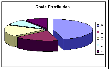
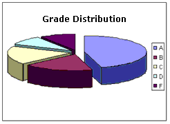
Excel allows you to make colorful charts and graphs from your spreadsheet data. 
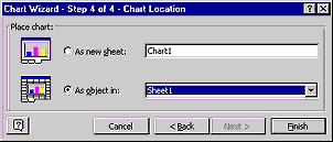
excel1c.gif (8697 bytes)

Charting
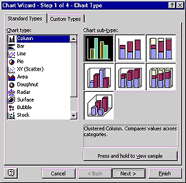
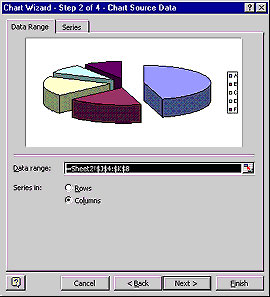
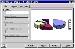
Excel has many charting capabilities to enhance your documents. You can graphically display your worksheet data in a chart.
  1. Select the cells you want to make a chart with
  2. Click the Chart Wizard graph.jpg (4385 bytes)icon on the Standard Toolbar. A Chart Wizard box will appear (Step 1).
  3. Select from the Chart type list the type of chart you want to create.

    For each type there are also several subtypes to choose from.

charting_anim1.gif (30587 bytes)

chart3.gif (8660 bytes)
  1. Click the Next button and the dialog box on the left will appear (Step 2).
  2. Check the range shown in the Data Range box to verify that the range includes the cells you want to chart.
  1. Click the Next button and the dialog box on the right will appear (Step 3).
  2. Add any additional features to the chart by filling in the text boxes and setting various option buttons.
charting_anim2.gif (11852 bytes)


chart6.gif (4637 bytes)

  1. Click the Next button and the final dialog box will appear (Step 4).
  2. Choose where you want the chart; in a new workbook or a current workbook. Click Finish.
  1. The chart is complete you can drag and resize it to fit in your document.
gradedist.gif (3860 bytes)
If you make a change to the data that the chart is based on... Excel will automatically update the chart.
 

All Powered by logos, trademarks and copyrights belong to their respective owners all over the world.